Email us at hi@forge.coop and we'll get back to you within 24 hours.
Growing a family run bakery into a nationwide direct-to-consumer brand
Cream Bakery is a family owned and operated bakery based out of New Jersey. Cream had been around for five years, serving wholesale accounts, before they decided to make the transition to direct-to-consumer.
Their initial foray into e-commerce was unsuccessful — their site experience was lacking, and they had difficulty with customer acquisition.
Cream approached us to help them find a way forward.
The Old Cream
Cream’s old website was built on squarespace and wasn’t optimized for mobile. The products weren’t merchandised properly, there wasn’t a cohesive brand aesthetic, and the imagery and reviews didn’t convey how loyal their customer base was, nor how delicious the desserts were. Cream, accordingly, was also underpriced because of their brand, site UI/UX, positioning, photography, and generic-looking product pages.
A New Look
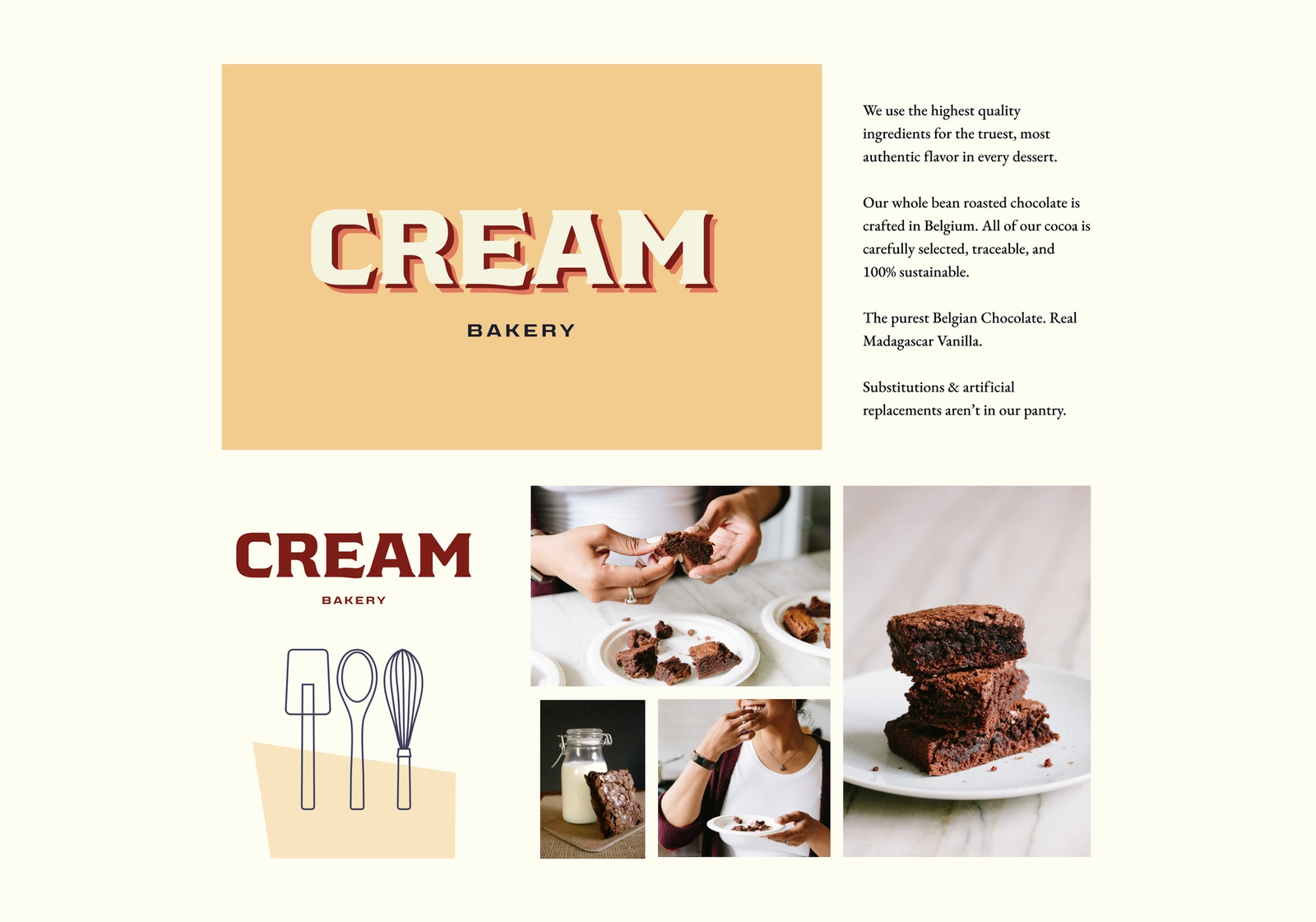
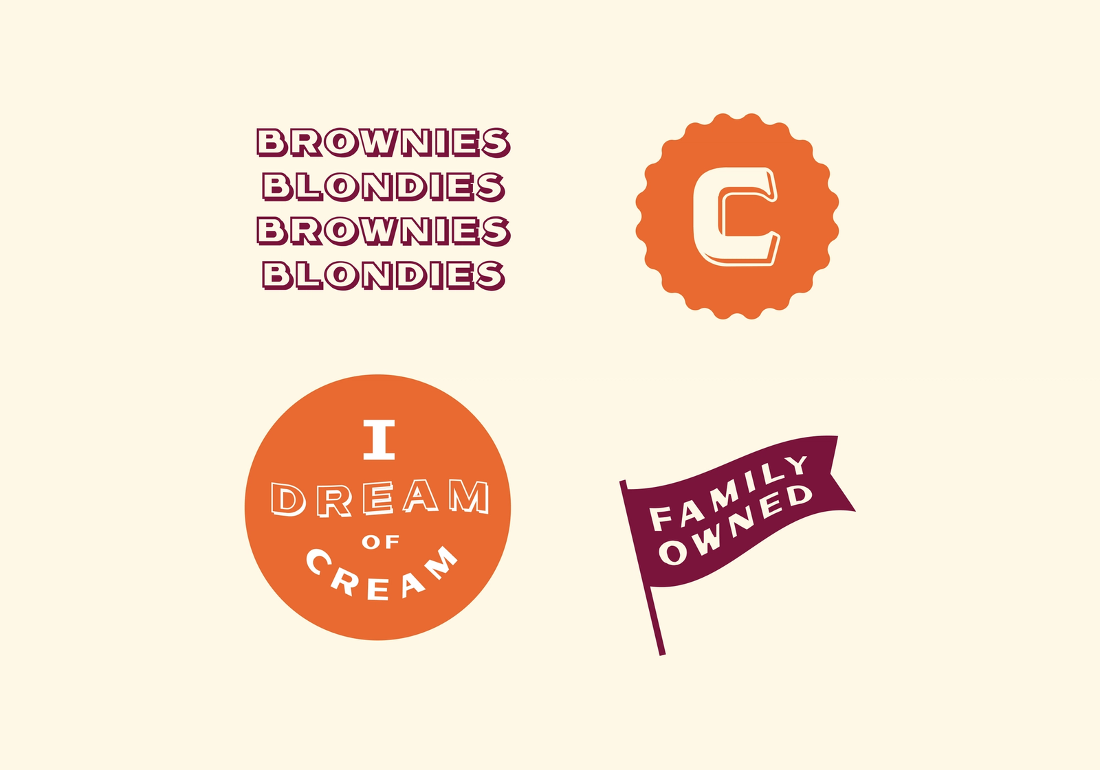
Our starting point with Cream was to rethink their branding and packaging.
We started with a deep dive to understand their business, customers, and most importantly, Cream’s philosophy of baking.
We took these insights and explored a few options.
We start by probing the “The Big Idea." What do we want to get across instantly? We had a few concepts.
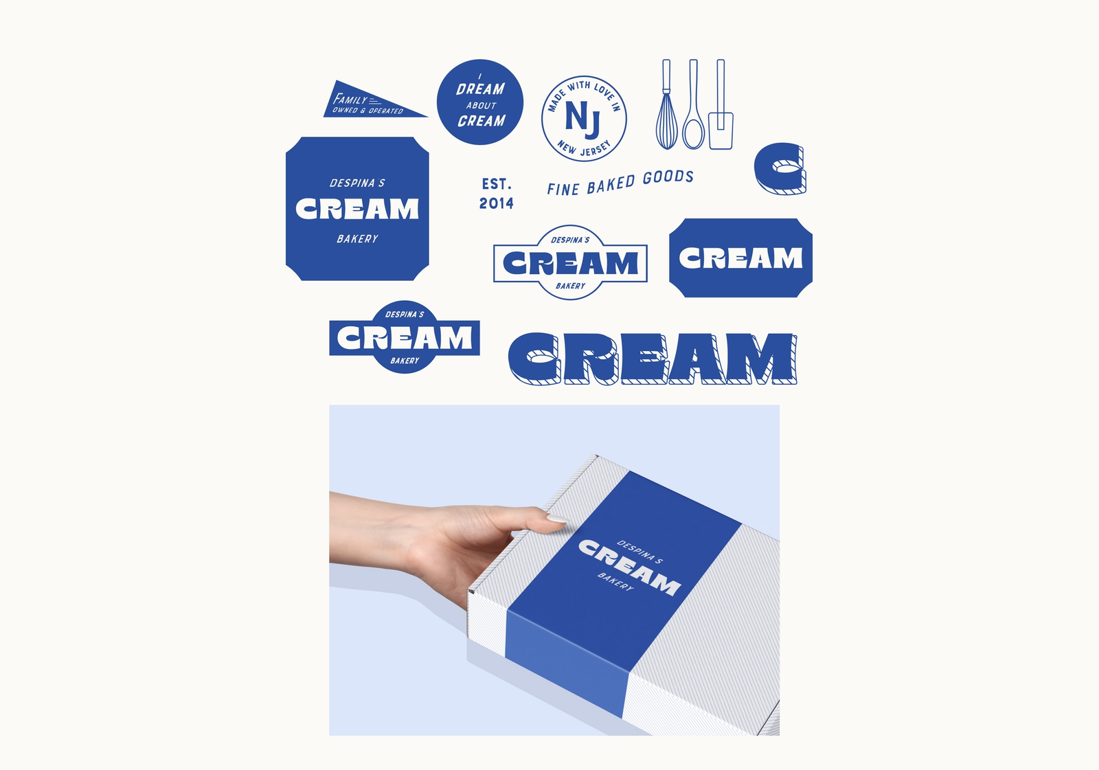
Concept 1: Cream is a Classic
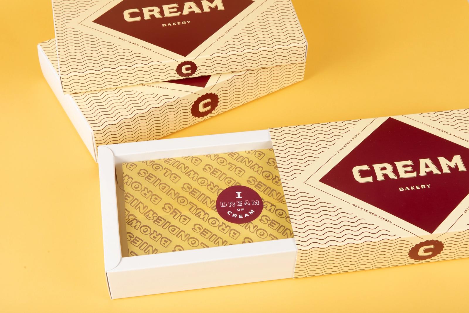
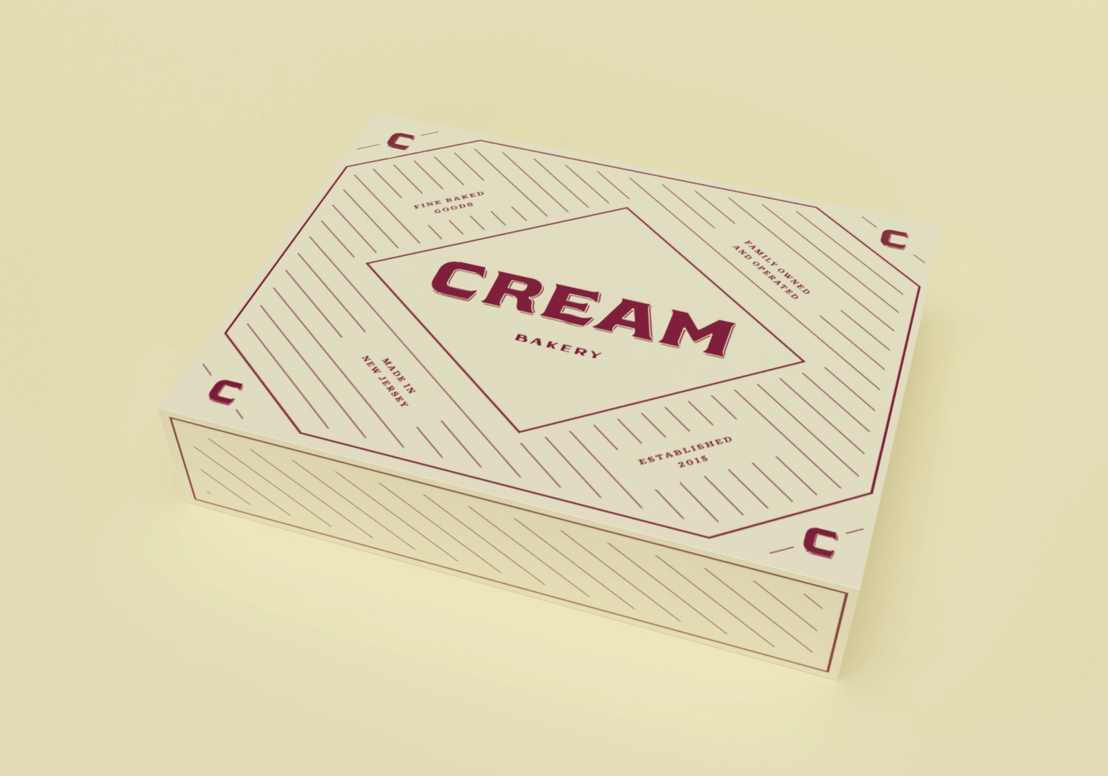
With a retro colorway and throw-back pinstripes, we wanted to emphasize the family-owned aspects of Cream with a look that looked more 1914 than 2014.
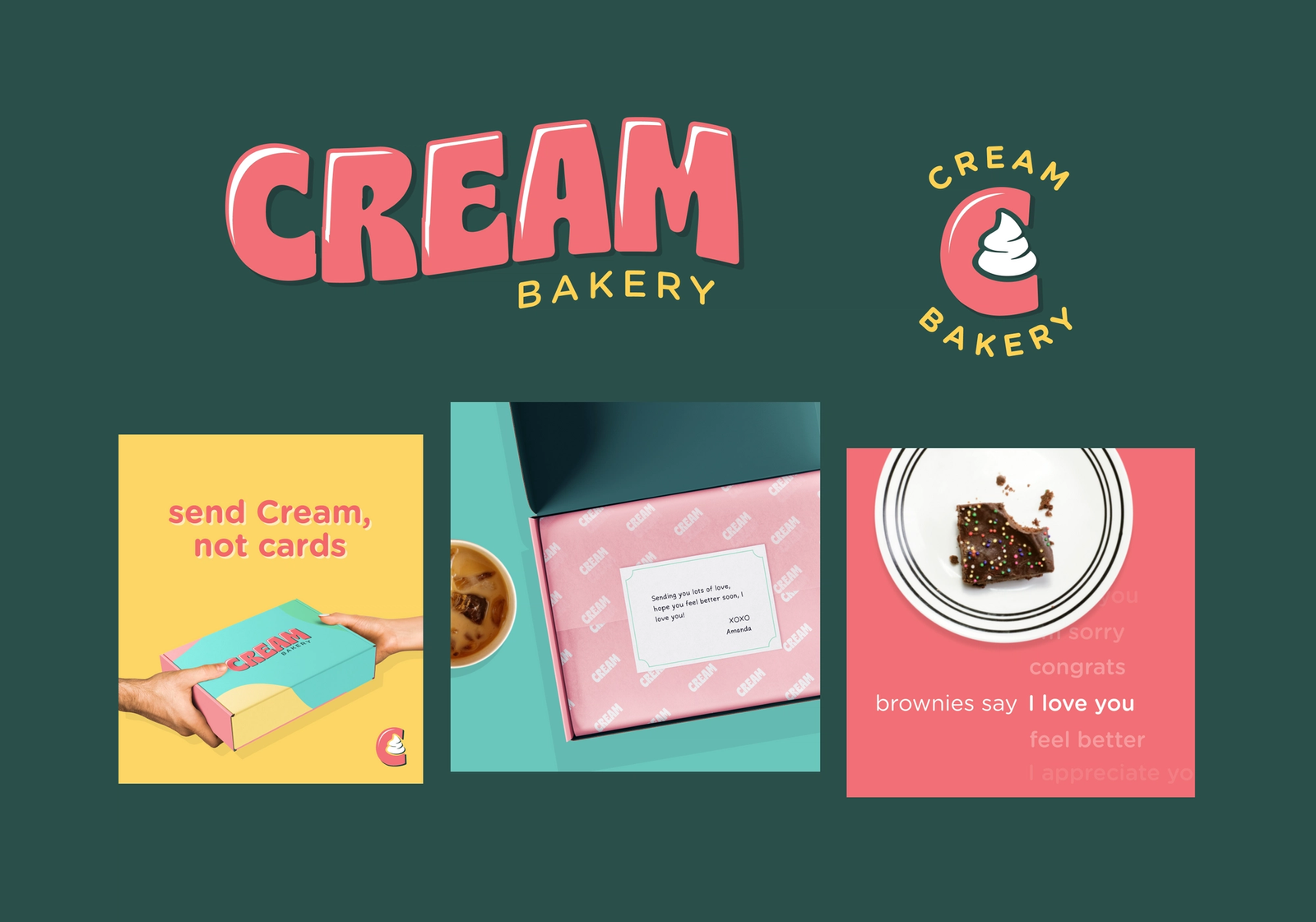
Concept 2: Cream is the perfect Gift
Our second concept was that Cream is the perfect gift for any occasion. If you need a gift, Cream is it. Period. Our creative focused on the fun aspects of gifting, bold packaging, and occasion focused messaging.
Concept 3: Cream is a quality indulgence
Our third concept is about differentiating Cream from other sweet treats. Despina, Cream’s head baker is an exacting and opinionated baker who holds her operation to a high standard. Each pastry is made with exceptionally high quality ingredients. Cream is an indulgence, but a worthwhile indulgence because of it’s superb quality.
After taking these ideas back to Cream, we landed somewhere between the aesthetics of “Cream is a classic” but with the messaging of the third concept.
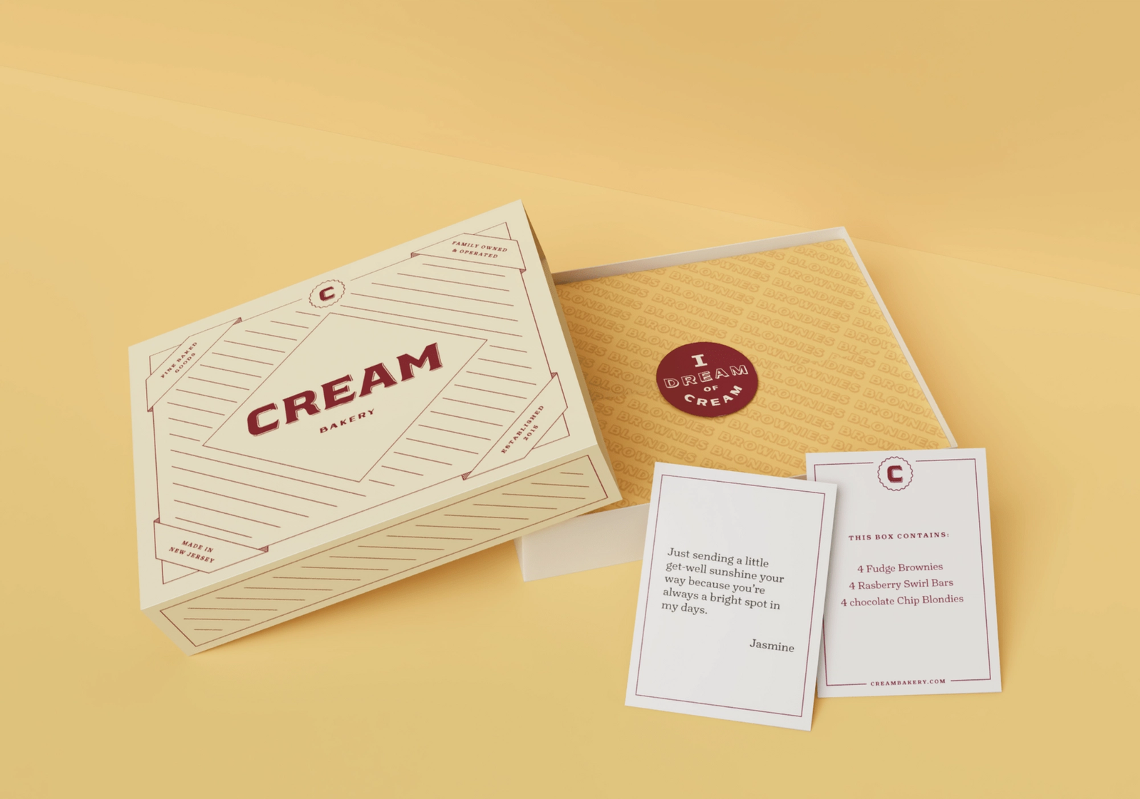
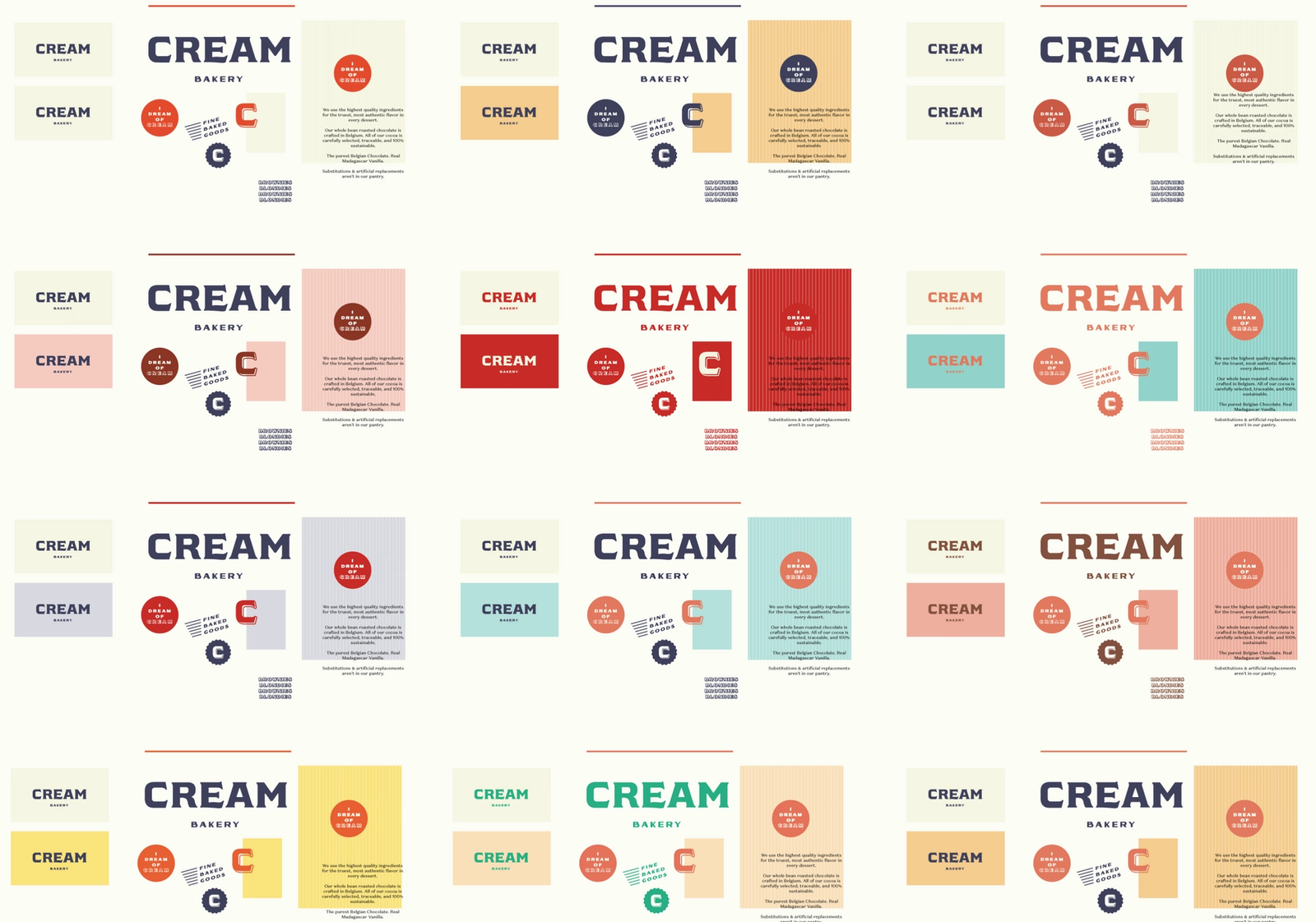
Packaging and Brand Exploration
Once we had the concept and aesthetic direction, we moved into packaging exploration. Here are a few concepts:
Positioning
Cream is one of the first direct-to-consumer only bakeries, and as such we needed the branding to come across as unique and elevated. Unlike bakeries like Milk Bar or Levain, there is no first touch-point in-store.
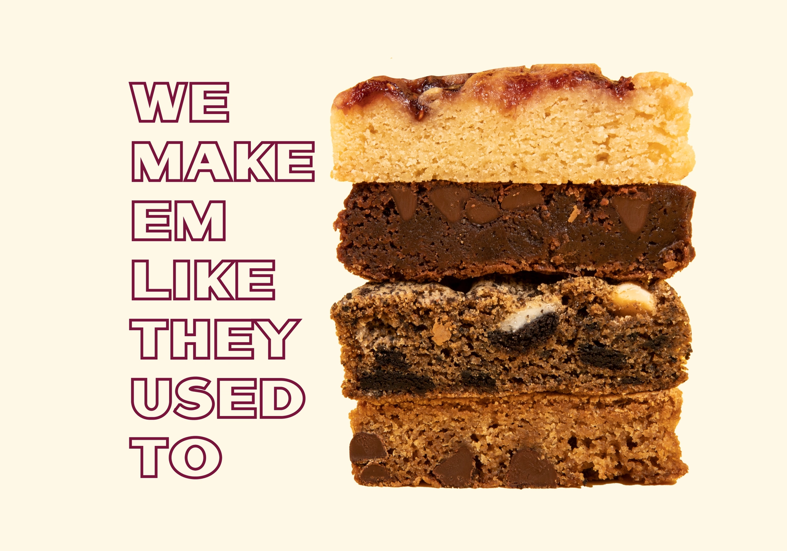
Our tagline is ‘We Make ‘Em Like They Used To’. Cream’s philosophy is to only use the highest quality, real ingredients: real butter instead of shortening, real madagascar vanilla instead of imitation, brown sugar instead of white sugar, etc.
There is a focus on crafting desserts like they used to, before mass manufactured sweets and goods, loaded with preservatives and optimized for cost-savings.
Art Direction and Photography
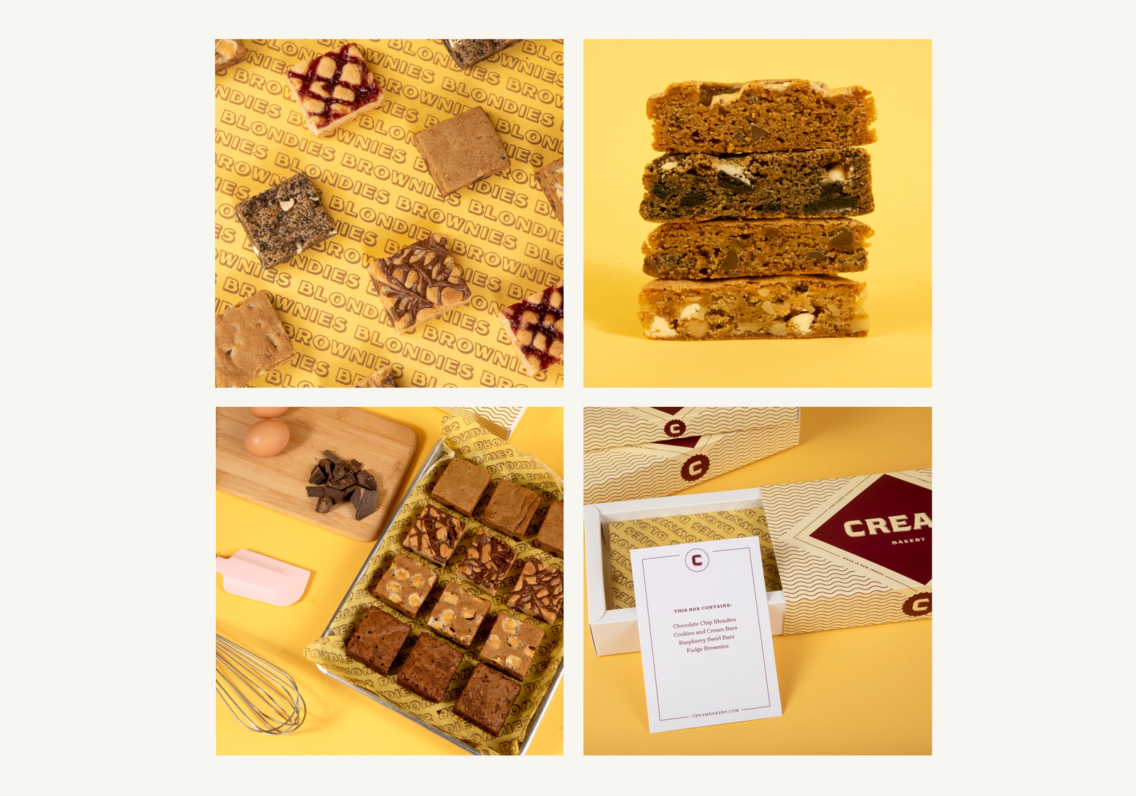
We produced and art directed all the site and brand photography.
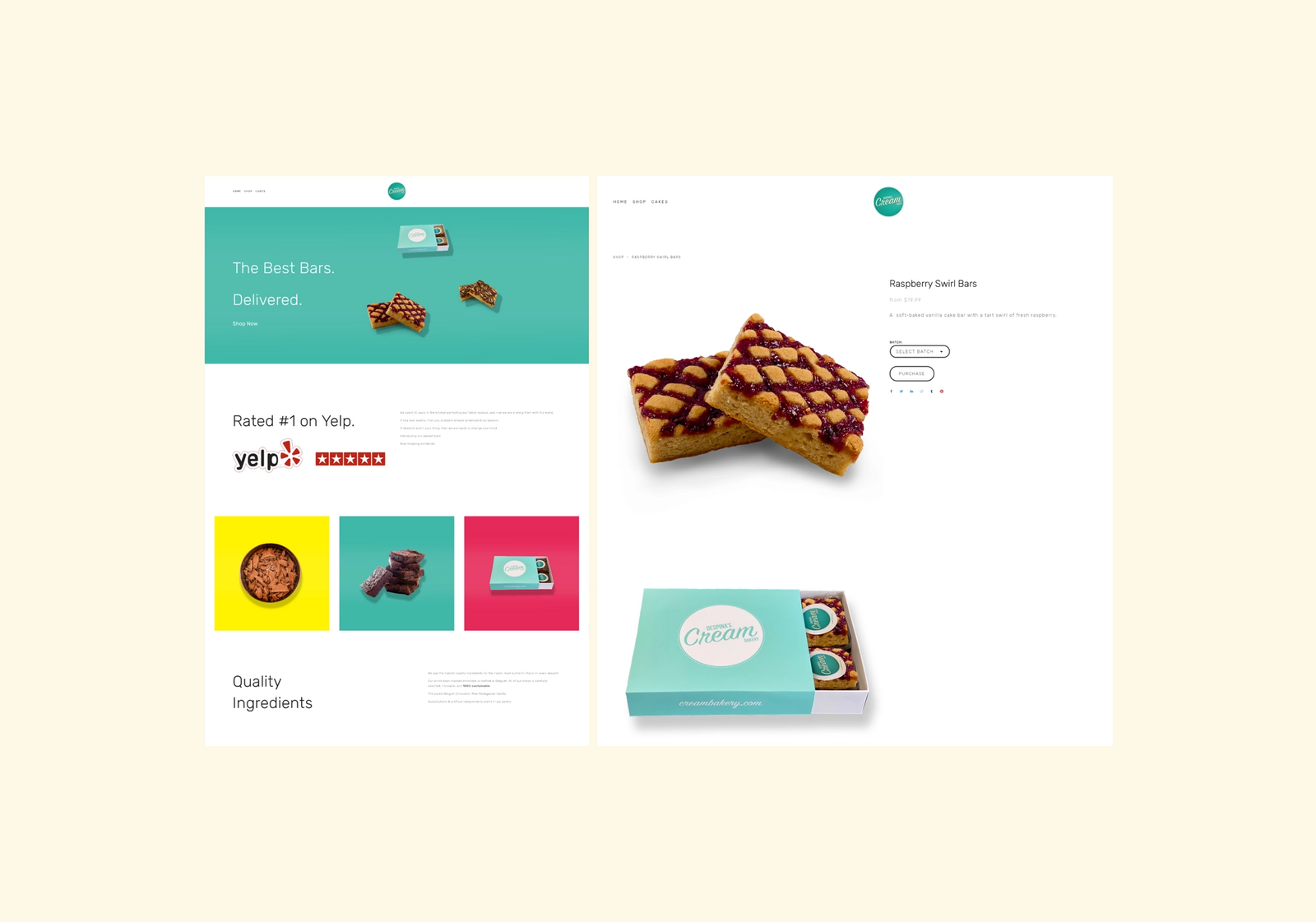
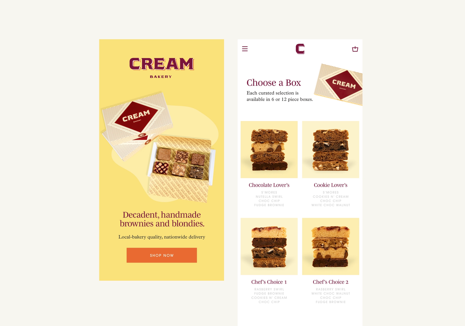
The Digital Experience
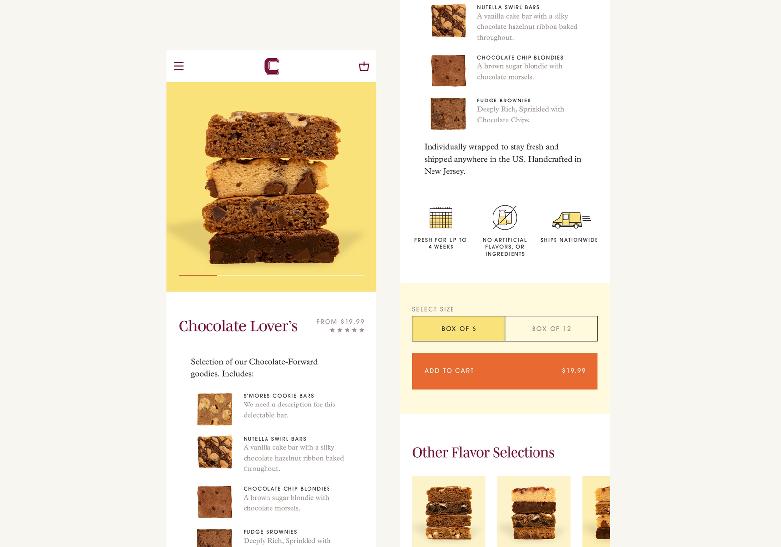
We wanted the site to feel classic, simple, highlight gifting, and focus on making decisions easy.
Outcomes
This was among one of our favorite projects — a virtual overhaul of every aspect of Cream's business, brand and operations.
We have become an operating partner to Cream, as this project was structured differently than most (a revenue share, rather than traditional project-fee).
We're excited to work with Cream to grow it out into a household name for making the best blondies and brownies in the world.
